What are the takeaways?
Naming
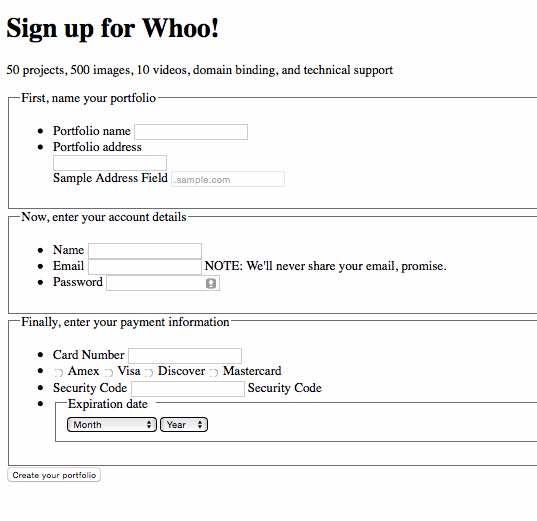
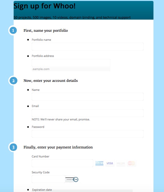
I found that the BEM naming system is very clear, scalable and portable. Instead of naming a form element something only I understand, such as text-size-half, I can use names that describe what the element does, like signup__disclaimer--small.
Accessibility
I had to plan my CSS carefully. For example, if I wanted to have an extra label or span for users with screen readers, but wanted it hidden from view, I had to "throw it" off-screen to the left. Hiding labels to the right or to the top breaks the tab order and ruins a keyboard-user's experience.
Plus, a site will have that disorienting effect where users can scroll into blank white space past the right edge of your site, if you hide labels to the right.
Also, I noticed how useful it is to declare font-weights in your CSS rules when applying a font to a heading element. Failure to do so allows some browsers to auto-bold the text. If using a large, geometric font, such as Roboto, this may make the text less legible than desired or planned.
Resources
Be wary of loading resources that aren't required - this includes javascript and fontstacks!
I keep my javascript at the bottom of the page, so it doesn't block page loading. However, I needed to be careful to place Modernizr.js above any other javascript that may depend on it.
Finally, I customized my modernizr sscript to detect only the features I needed it to.